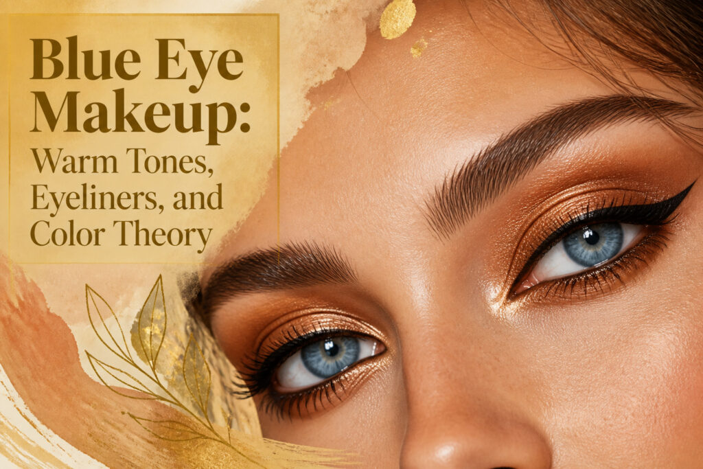
Makeup with blue eyes works best when you lean into warmth rather than matching the cool tone. The common mistake is reaching for blue shadow, which flattens the iris into one dimensionless plane instead of making it pop.
A $39 Vieve palette built around gold and bronze sits opposite blue on the color wheel, and that contrast is what creates the brightness.
Gold Eyeshadow
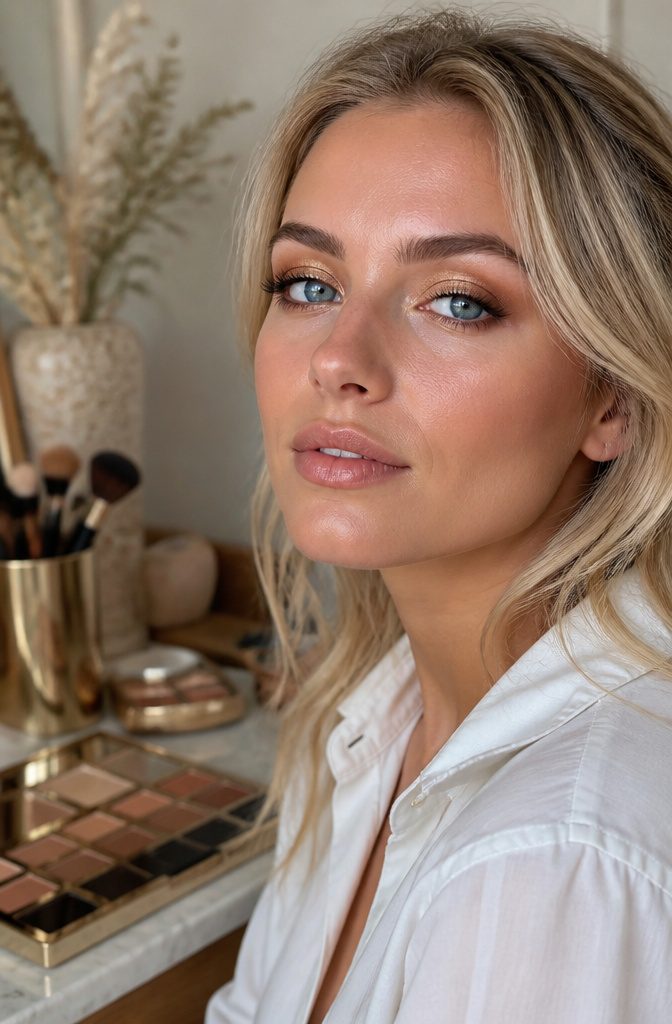
Warm tones sit opposite blue on the color wheel, and that contrast is what makes gold eyeshadow work so dramatically on lighter irises.
The molten quality of a true gold catches light and throws it back into the eye, amplifying the natural brightness without competing with it.
Vieve Soul Shadows Eyeshadow Palette in Gilt, at $39, was built around this exact effect.
The creamy powder formula feels weightless once it is on, and the specific shade sits in that useful space between gold and bronze, warm enough to create dimension but not so orange that it reads dated.
Two ways to wear it: keep it sheer and diffused for daytime, where the shimmer does the work, or layer it over a deeper shadow and press it on with a damp brush if you want the metallic to read as intentional rather than accidental.
The wet technique intensifies the pigment but the blend still holds, which matters because a streak of unblended gold is the fastest way to look like you are trying too hard.
Weight matters here too. Heavy or too-dark options can look weighted on the lids, so the sheerness of this formula is part of the point.
Light hues or sheer colors are often all it takes to emphasize blue eyes; the layering comes after you have seen what a single wash does on its own.

6-pan set of leveled-up, pressed pigment eyeshadow powder creates buttery, high-intensity shadows for major color payoff with minimal fallout

Intensely Versatile - Transform your look with a curated blend of 9 luxurious shades that shift effortlessly from a soft daytime glow to a dramatic nighttime allure. Enjoy seamless blending for a finish that adapts to every style with precision.

✦MATTE AND SHIMMER COLORS: Both matte shadows and shimmers have velvet creamy texture in range of metallic, satin, and matte finishes. Each color is unique, easy to layer and blend. You can use base primer for better application. If you get a damaged eyeshadow palette, please feel free to contact us for a best solution.
Smokey Eyeshadow
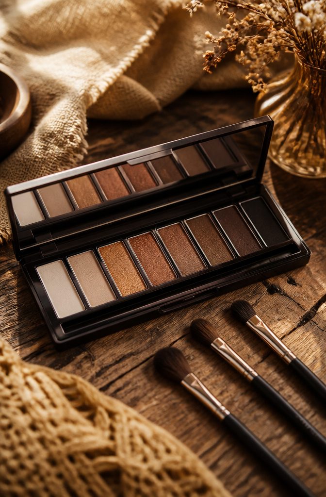
Smokey eyeshadow on blue eyes works best when you skip the default black and build warmth upward from brown.
The Smokey Eye Drama Kit in Lavish Onyx layers chocolate brown through the outer crease, taupe across the inner lid, and onyx only at the outer edge, diffused inward so the color graduates rather than sitting flat.
That graduation keeps the iris from looking one-dimensional, which is the usual risk with heavy dark shadow.
The Masterpiece Nude Eyeshadow Palette in Golden Nudes adds a different angle: its deep charcoal blended into the socket with a fluffy brush gives soft definition without the harshness of pure black, while the gold hues underneath catch the light that blue eyes already reflect.
Purple works too, if you want to push the coolness further, though the undertone matters more than the depth.
A burgundy shade with blue undertones, swept across the lid and paired with a smudged feline flick, can make the eye color read brighter by contrast.
The common thread is layering, not packing, and keeping the darkest color at the perimeter where shadow naturally falls rather than across the whole lid.

PARTY-READY EYE LOOKS: This sheer, dazzling eyeshadow topper plays up your eyes with a mesmerizing, long-lasting wash of sparkle.

Mesmerizing Duochrome Color Shift: Features a high-pigment, chameleon formula that dynamically shifts from a soft Plum Mauve base to an iridescent Blue Green sparkle, creating a stunning, multi-dimensional polarized effect that changes with the light.

BLEND IT, BEAUTIFUL: These eyeshadows have a silky sheer formula that blends easily
Brown Eyeshadow
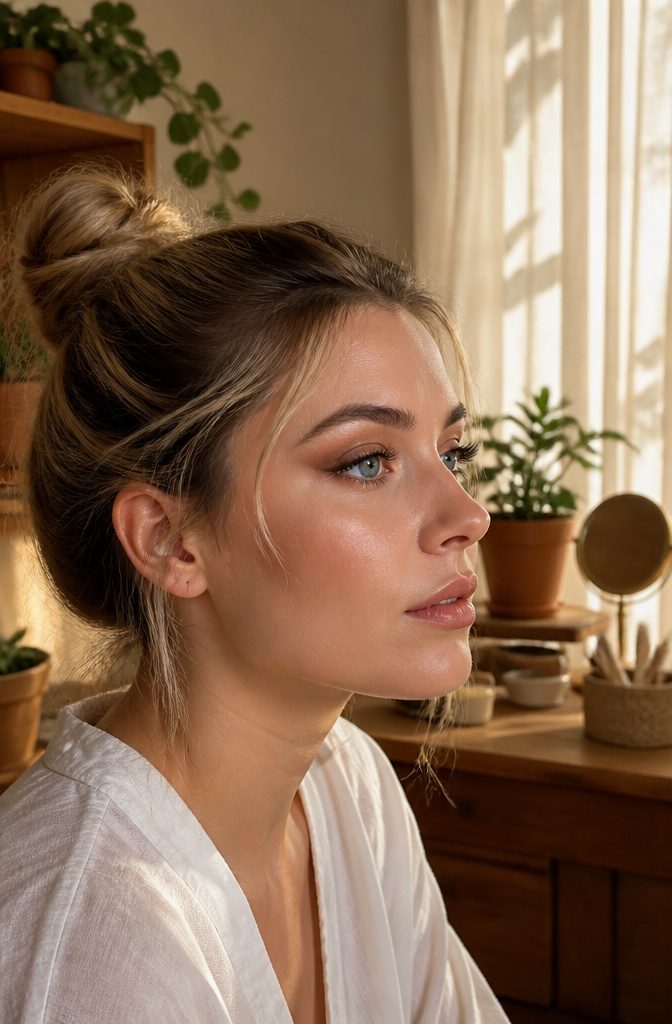
Brown eyeshadow does the defining work of black without the harsh edge.
Where a sooty liner can flatten blue eyes into monochrome, a warm cocoa or soft bronze carves out depth and keeps the focus on the color itself. I reach for this when I want structure, not stage makeup.
The Masterpiece Nude Eyeshadow Palette in Golden Nudes builds that warmth in layers worth naming: a pale champagne across the lid, a mid-tone camel through the crease, and the palette’s deeper charcoal only at the outer corner for soft winged definition.
Used wet, the golds turn metallic; used dry, they stay polite for daylight. The same palette carries both modes, so the investment sits at one price point instead of two.
Skin tone tilts the choice. Olive complexions pull the golden undertones forward; rosier skin reads the same shade as ruddy or tired.
That warmth-for-olive rule is the same one that governs mascara color, and it holds here too: cool browns fight warm skin, warm browns settle in and look like shadow that happened, not shadow that was applied.

Cool-Toned & Ready - Full of cool, neutral taupe shadows in matte and metallic finishes to create the most flattering looks from smokey to everyday, natural makeup.

Cool-Tone Nude Matte Shades for Effortless Smokey Eyes - This mini eyeshadow palette includes 6 cool-tone nude and grey matte shades designed to create natural daytime looks or a classic cool smokey eye. Neutral colors flatter most skin tones and eye colors, making it a versatile essential for everyday makeup and special occasions.
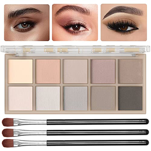
【Professional Matte Finish Eyeshadow Palette】This ten-color makeup eyeshadow palette, crafted for mature women, blends warm and cool-toned pigments from soft pink to deep brown. Achieve silky matte and classic smoky eyes with seamless, flawless results. Suitable for both dry and wet application, it allows free mixing and blending to create everything from natural, elegant looks to bold, stunning effects!
Copper Eyeshadow
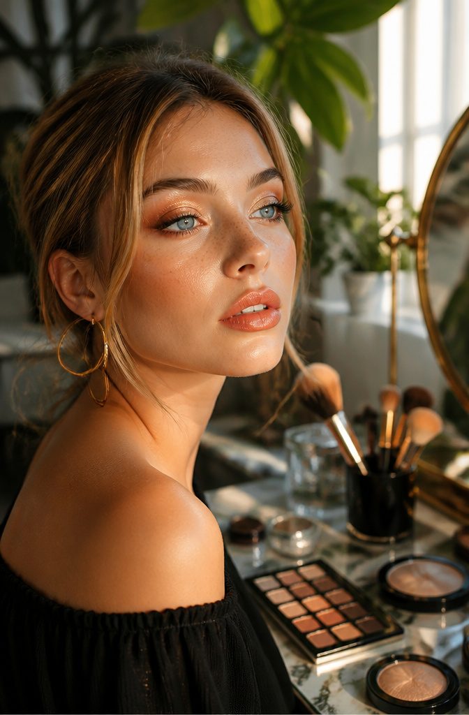
Copper sits at the center of almost every recommendation for makeup with blue eyes, and the reason is straightforward color theory.
Warmth against coolness creates the visual pop. The orange base in copper shadows pushes against the blue in the iris, making that blue read as more vivid and more dimensional than it does alone.
Ana, a makeup artist who works with this palette regularly, reaches for the Code8 Iconoclast Eyeshadow Palette in Burnt Sienna when she wants that contrast to land.
The palette uses a Knead Technology that bakes the shadows with sweet almond and evening primrose oils, so the finish stays silky rather than chalky.
She’ll sweep the shimmering apricot shade across the whole lid for a wash of color, or wet the brush first if the goal is deeper intensity.
That wet application shifts the copper from a daytime suggestion to something richer without changing the underlying warmth that does the work.
Lisa Eldridge’s Liquid Lurex Eyeshadow in Anjelica approaches the same idea from a slightly different angle, blending rose-gold, bronze, and copper into one liquid layer that dries down fast.
The result in certain light is what reviewers describe as almost crystalline, the blue eyes behind it seeming to sharpen into focus.
The practical choice comes down to texture preference and how much color control you want.
A cream or liquid gives one sweep and done. A powder palette like the Burnt Sienna lets you build, blend, or pull back, which matters if your morning routine already has enough fixed steps.

1️⃣ Cool Taupe Matte Eyeshadow for Daily & Smokey Makeup This matte eyeshadow palette features cool taupe eyeshadow, grey brown and charcoal shades, perfect for daily makeup, office makeup and smokey eye makeup, especially suitable for mature women and mature eyes.
1️⃣ Cool Neutral Brown Everyday Color Palette This 5 color matte eyeshadow palette features taupe, beige, clay, mocha and charcoal shades designed for effortless daily makeup, office looks and natural soft glam eye styles. Perfect for cool tone nude smokey eye makeup.

Glitter, Glitz & Grey - This grayscale eyeshadow palette is a smokey eye lover’s dream. With 3 glitzy metallics and 6 blendable matte eyeshadows, you can create the easiest smokey eyes ever.
Burgundy Eyeshadow
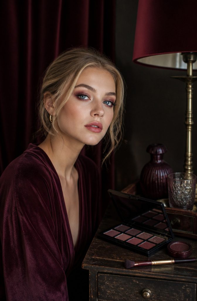
Burgundy sits a few shades deeper than copper on the same warm family tree, and that extra depth is what makes it read as drama rather than glow. The undertone matters more than the depth itself.
A true burgundy carries enough red to push back against blue iris pigment the way complementary colors are supposed to; lean too far toward plum or wine, and you have crossed into purple territory, which does something else entirely to blue eyes and not always something better.
The mistake I keep making is buying a shade that looks burgundy in the pan and turning my lid eggplant in practice.
Low light in the store is the usual culprit. What reads as brown-red under fluorescent bulbs goes full violet once I get it home and blend it out.
Now I hold the open compact near a window before I buy, and if the swatch on my inner wrist pulls more raisin than rust, I put it back.
Application is where the warm balance pays off.
A burgundy wash across the lid, kept below the crease, gives blue eyes a saturated frame without the harshness of true red. The color does the work; you do not need much else.
I skip liner on those days and let the depth of the shadow carry the definition, which also sidesteps the purple risk of layering a cool black over a borderline-warm base.
The next section covers purple directly, where the line between these two shades becomes the whole point.

❤️Highly Pigmented: Our liquid metallic burgundy eyeshadow offers a stunning, mirror-like sheen that instantly elevates any eye look. Just one swipe of the liquid shimmer red eyeshadow delivers a vibrant bold looks. Smudge-proof metallic eyeshadow for hooded eyes. Whether you're going for a soft, smoky burgundy or a deep, dramatic gothic eyes.

Easy-to-wear shades. All-day wear.

EYE ENHANCING SHADOW PALETTE : Available in four expertly curated, beautifully pigmented all day wear eye shadow color stories that are easy to use and glide on smoothly without creasing to effortlessly enhance your eye color
Purple Eyeshadow
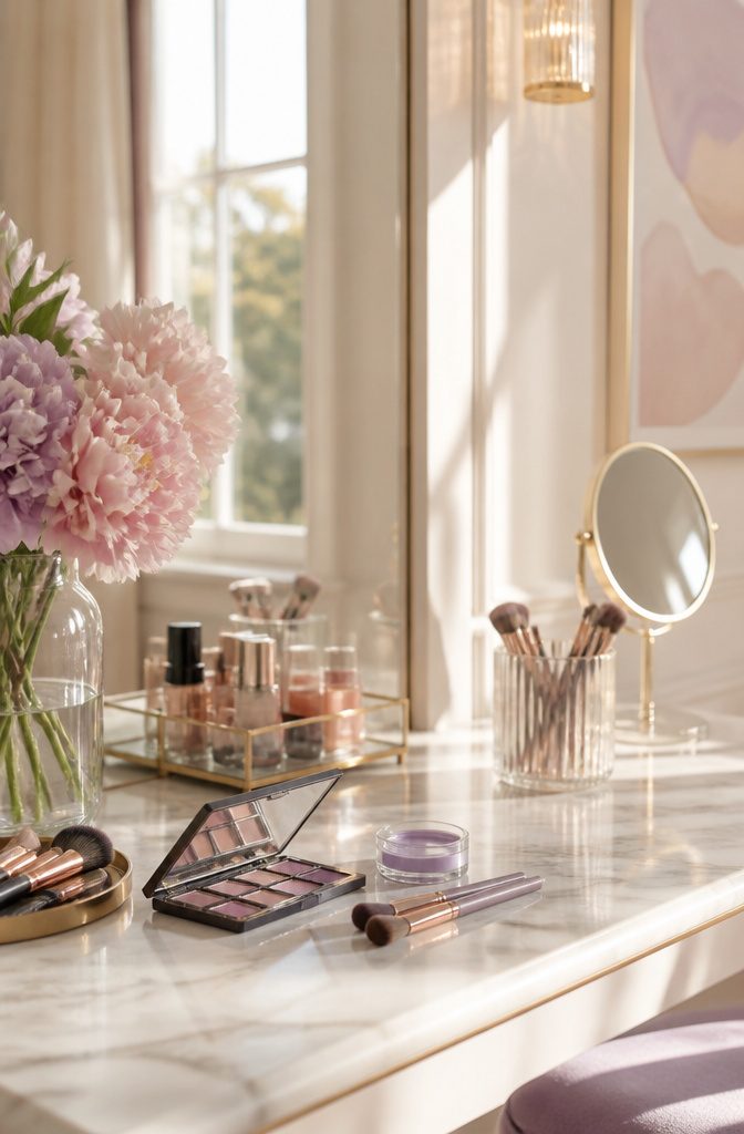
Purple sits opposite yellow on the color wheel, which makes it a true complement to blue eyes in a way that warm tones only approximate.
Where orange and copper create contrast through proximity, purple works by subtraction: it cancels the yellowish undertones that sometimes dull blue irises, leaving the color itself to read more vivid.
The distinction between purple and blue eyeshadow matters more than I expected when I started reading into this. Purple, even in deep plum or soft lilac, frames blue eyes without competing for the same wavelength.
Blue shadow, by contrast, tends to flatten everything into one cool plane; the eye loses dimension rather than gaining it. Sources describe this as a common misstep, and the logic of the color wheel backs it up.
Application makes the difference between a bruised look and a dimensional one. Sheer layering is the technique that saves purple: a wash of translucent pigment built in three or four passes, letting each layer set before the next.
Cream bases sheered with a fingertip, then powder tapped over the top. Density comes from patience, not from loading a brush once and hoping.

【High Pigment Color Payoff】 Each 9-color palette delivers rich, highly pigmented payoff in one swipe. From soft neutrals to bold metallics, the formula blends smoothly without patchiness for professional eye looks that last all day.

Your Golden Hour Muse: Let the Aurelia palette inspire your mood. This curated collection of 9 warm-toned neutrals—from soft matte browns to luminous coppers—is designed to effortlessly create that perfect, sun-kissed soft glam look, whether for day or night

Multicolor:Eyeshadow palette has a variety of bright colors for you to choose from,you can easily mix and match colors,reasonable color matching,and eyeshadows with high pigmentation will make your eye makeup look more lustrous
Navy Eyeliner
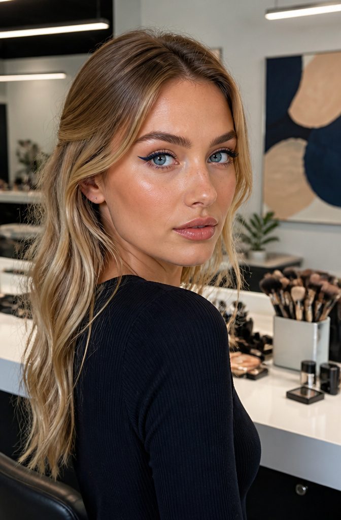
Navy eyeliner lives in the useful middle ground that most blue-eyed people skip right over. The reflex is to avoid blue entirely, since matching the iris tends to flatten it into one muddy pool of color.
Navy defines the eye without competing with it, close enough to black to feel like a real liner, but shifted just enough toward the iris tone to soften the edge.
Black liner carries a risk that shows up in photos more than mirrors. The harsh contrast can shrink the eye visually, especially on fair skin where the jump from black lid to white sclera reads as a hard border.
Navy keeps the definition but lets the blue of the eye itself do the enlarging work.
Chanel Le Crayon Yeux in Blue Jean, at $36, is the one that comes up consistently for this.
It is softer than black, more interesting than brown, and the slight tonal echo with the iris draws attention to the color rather than framing it out.
Tightlining changes how this reads on the face. Running the pencil along the upper waterline, between the lashes rather than above them, fills the gaps and thickens the lash line without adding a visible stripe of color.
Lifting the lid gently with a ring finger exposes that line without pulling the skin. The result reads as fuller lashes and more defined blue eyes, not as eyeliner at all.

Glitter-Eyeshadows: Formulated with premium ingredients, this liquid shadow has a fine texture and easy to color. This sparkling-gloss eye shadow will bring you beautiful eyes.

Blue Gemstone Eyshadow Palette by Docolor: A versatile 9-color eyeshadow palette that offers limitless creative potential. Thoughtfully curated, this eye shadow palette encourages individual expression through its striking shades inspired by blue gemstones, designed to give your eyes a captivating, jewel-like radiance
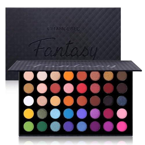
A magically iridescent eyeshadow palette contains professional cool and warm-toned pigments and shades. With different textures: soft smooth mattes, shimmery pressed pearl and dazzling metallic glitters. This richly toned palette features versatile shades that can be blended and layered to create endless amounts of looks.
Bronze Eyeliner
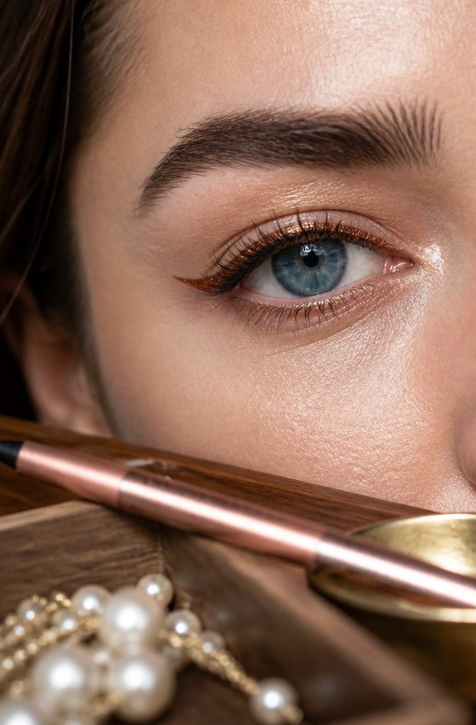
A warm bronze eyeliner lands exactly where eyeshadow and liner overlap, which is why it works so well for blue eyes.
The metallic warmth sits opposite blue on the color wheel, so the contrast reads instantly without looking like you tried.
Laura Mercier’s Caviar Stick Eyeshadow in Burnished Bronze, at $33, glides on as a cream and sets to a crease-resistant finish.
Makeup artists reach for it specifically on blue eyes because that warm metallic tone brightens the iris rather than competing with it.
Victoria Beckham’s Satin Kajal Eyeliner Pencil in Cinnamon, also $35, blends bronze, copper and chocolate undertones into a softer line than black.
Smudged along the lash line, it gives that warmth makeup artists talk about for cool-toned eyes, the definition without harshness.
Both formulas move between categories.
The Caviar Stick can line or wash across the lid; the Satin Kajal blends enough to serve as a quick shadow. For daily wear, that flexibility means one product does the work of two.

【❤All-in-One Makeup Pallet for Teens & Women】UCANBE Pretty All Set make up palette features 86 versatile & ultra-blendable shades, including 80 eyeshadows, 2 highlighters, 2 blushes, and 2 contours. Pigmented eye shades ranges from black gray white silver goth eye makeup shades to bright rainbow colors to sparkling metallic glitters to rose rustic nudes & brown taupe neutrals, and multi-finishes ranges from smooth mattes to velvety shimmers to dazzling metallic to fine pressed glitters.

【COOL-TONED MATTE COLOR STORY】Featuring 10 coordinated matte shades in soft peach, nude taupe, dusty mauve, muted plum, cool gray and charcoal brown, this palette makes it easy to create natural everyday makeup or dimensional smoky eye looks.

【Professional Neutral Tones】Elevate your eye makeup game with the SUSIKEKI mini size eyeshadow palette. This carefully curated pallet features six stunning shades of neutral tones, ranging from soft taupes to rich browns. Create versatile looks with ease, perfect for both makeup beginners and professionals.
Cream Eyeshadow
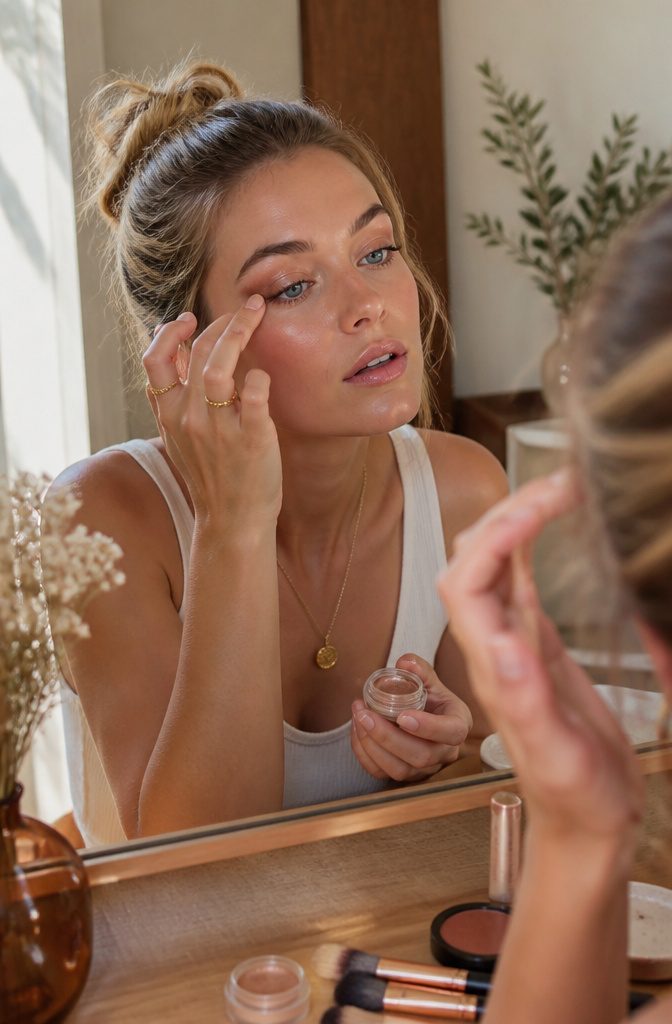
Cream eyeshadow sits somewhere between skincare and pigment, which is why it tends to win for anyone who wants the color to look like it grew there rather than landed there.
The formulas now come in enough shades that "cream" describes a texture, not a color family.
RMS Beauty Eyelights Cream Eyeshadow in Spark runs champagne-bronze, and Charlotte Tilbury Eyes to Mesmerize Cream Eyeshadow in Walk Of No Shame sits between rose, copper, and plum. Both are built for blue eyes, though they approach the job differently.
Spark reflects light across the lid and gets noticed, while Walk Of No Shame builds contrast through that berry-adjacent warmth that most people skip when they reach for the usual bronze.
The finish on these is skin-like enough that finger application works better than a brush, at least for the first layer.
The warmth of your hand thins the cream to the right density, and you can feel where it is going instead of guessing.
If you need the color to hold through a long day, a thin wash of cream left to set for thirty seconds before a powder shadow pressed on top will outlast either layer alone.
That is the method I have seen described as the one that actually stays: cream for the color, powder for the anchor, not the other way around.

❤. This BLACK METEORS eye palette is mixture of 15 stunning cool toned shades that velvety & go on smoothly texture with matte satin finishes to create next level looks to unleash your artistry. Each blendable, buildable and long-lasting, created to suit every skin tone and eye color.

The UCANBE COLOR CLUB series features 7 different styles of eyeshadow palettes, each with 12 colors, providing makeup enthusiasts with a full set of eyeshadow colors from day to night, including brown, rose, gold, gray, taupe, white, silver and charcoal black. From natural makeup to smoky eye makeup, all you need is a light swipe.

Smokey & Glamorous Shades – A perfect mix of matte, shimmer, and glitter shades in black, silver, and gray tones for sultry, dramatic, or soft glam eye looks.
Tinted Mascara
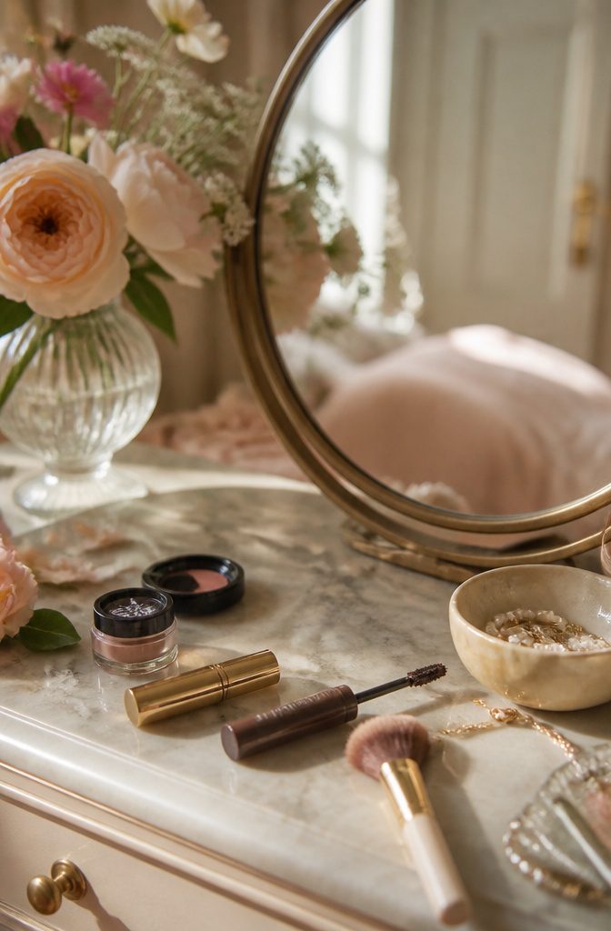
Brown mascara lands softer than black against blue eyes, framing the iris without boxing it in.
The warmth reads as complement, not contrast, and that difference matters more than I expected when I finally swapped my usual tube. Black gave me lashes; brown gave me eyes.
Finding a formula with real staying power took longer than sources let on.
Most articles skip the product hunt entirely, as if any brown wand will do. The ones that worked for me carried enough pigment to read as defined, not wishy-washy, without tipping into auburn territory that fought my skin tone.
The lash curl matters just as much as the tint. A gentle lift opens the eye and exposes more iris, which is exactly what brown mascara is meant to highlight.
I clamp at the base, hold three seconds, release, and repeat at the midpoint for a shape that looks awake rather than theatrical. The curl doesn’t need drama; even a slight bend changes how the color reads against blue.
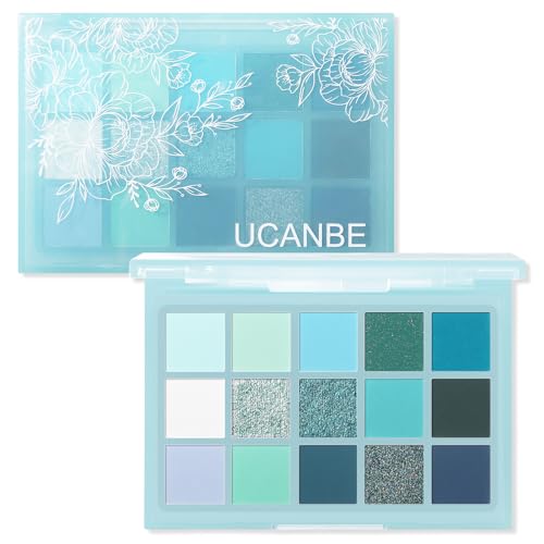
SPECTRUM OF SHADES – A curated mix of matte, shimmer, and metallic finishes ranging from soft mint green, bright blue and icy aqua, to deep teal, midnight navy and silver. The palette is designed to capture the full depth of water tones, letting you create looks that are both fresh and dramatic.
One swipe color

High Pigmented & Vibrant Shades: Maki Yika Crème eyeshadow palette is designed for crafting stunning eye makeup looks that range from subtle to bold, including snow black, dark, plum, puff, blue, coffee, brown etc. The matte & shimmer eyeshadows are perfect for daily wear, festivals and performances
Why Warm Tones Work
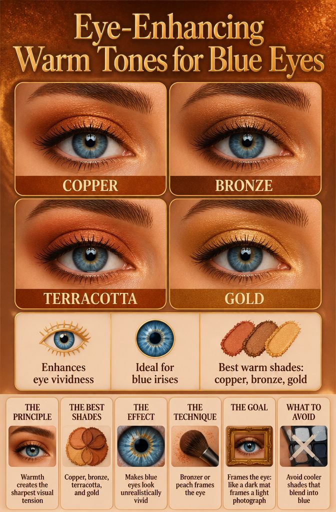
The principle behind makeup with blue eyes is simpler than most product guides let on. Blue irises sit at the cool end of the spectrum, so warmth in the shadow creates the sharpest visual tension against them.
Copper, bronze, terracotta, and gold all push against that coolness rather than blending into it, which forces the eye to register the blue as more vivid than it reads alone.
Makeup artists keep returning to this pairing not out of habit but because the contrast is automatic.
A bronzer washed across the lid and through the socket, or a peach with just enough warmth in it, does not compete with the iris; it frames it the way a dark mat frames a light photograph.
"Warm tones are the best friend for people with blue eyes. Copper, bronze, terracotta, and rust are the shades that make blue eyes look almost unrealistically vivid. The contrast between the warmth of the shadow and the coolness of the iris creates a tension that draws the eye in."
— Vogue
That tension is what the ten product sections below are built on. Each one tests a different temperature of warm against blue, from a shimmery apricot laid down sheer to a deeper orange wet-brushed for intensity.
The specific shade matters less than the direction of the shift: toward heat, never toward more cool.
What Flatters and What Flattens
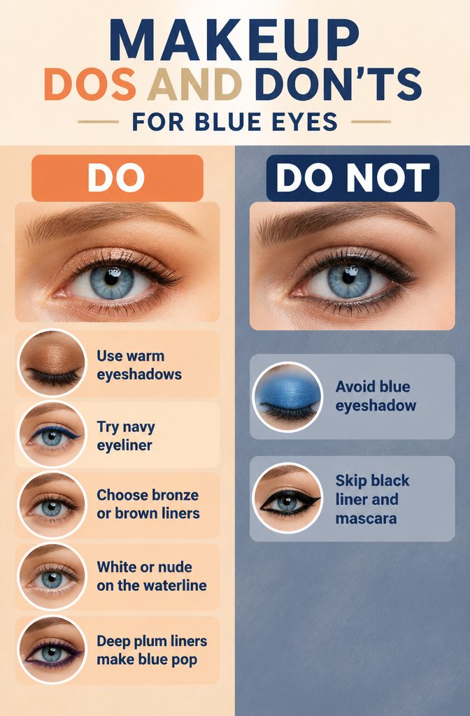
Blue eyeshadow sits right next to the iris on the color wheel, which means the two tones blend rather than contrast.
The result reads as a flat wash instead of a pop. I learned this the expensive way after buying three palettes of varying blues and watching each one disappear into my own eye color without adding any visible dimension.
Black liner and black mascara shrink the eye and read harsh against fair skin, which many blue-eyed women have.
The hard edge closes off the lid and can make the whole area look smaller and more severe than it is. Makeup artists who work with blue-eyed clients regularly skip straight black for this reason.
Navy is the exception that proves the rule. Chanel’s Le Crayon Yeux in Blue Jean, at $36, sits close enough to black to feel familiar, but the tone echoes the iris itself.
That similarity creates soft definition that makes the eye look larger and draws attention to the blue rather than competing with it.
The effect is subtle but it works, and it is the only blue-family product I would keep in rotation.
Bronze, brown, or deep plum liners do the heavy lifting instead.
Purple’s red undertones pull out the brightest form of blue in the iris by contrast. White or nude on the waterline opens the eye back up if you need that brightness.
Concealer and the Eye Area
Dark circles under the eyes share the same blue-purple wavelength as the iris, so when both compete for attention, the face reads as tired rather than bright.
Neutralizing the under-eye tone matters more than piling on coverage. The goal is canceling that discoloration, not building a pale mask that photographs like a raccoon stripe in daylight.
The women I picture reading this, the ones already checking ingredient lists before checkout, will want a concealer whose formula backs up the claim.
Natural ingredients rank high for this group, and a clean-ingredient concealer with enough peach or salmon offset in it does the actual work of correcting blue-purple shadow. Full coverage helps, but the undertone does the real job.
A tiny tap of golden highlighter at the inner corner, placed after the concealer sets, keeps the brightness focused near the iris itself. That placement draws light toward the blue rather than letting the under-eye compete with it.
Skin Tone Adjustments
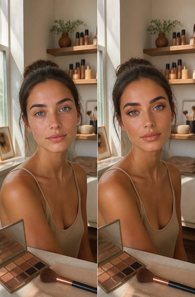
Olive skin carries copper and bronze with an undertone that keeps them from tipping into pure orange.
Rosy complexions usually need softer golds and browns; the same copper that looks refined on olive can read brassy against pink in the cheeks.
I learned this the hard way with a copper shadow that turned straight pumpkin on me. The depth was wrong, not the color itself.
Warm tones need enough brown in the base to sit naturally against your particular skin. A muted bronze, like the shades in Suqqu’s Signature Color Eyes Palette in 03 Hikarigure, gives that depth without competing with blue eyes.
For blue-eyed women, makeup artist Ana often reaches for shimmering apricot across the lid. But apricot on rosy skin can pull coral fast.
If your complexion runs pink, start with a wash of soft gold or a brown with just enough warmth, then build. The contrast against cool blue eyes still works; you are adjusting the temperature, not abandoning it.
Frequently Asked Questions
How can you make blue eyes stand out?
Warm, contrasting colors create the sharpest visual tension against cool blue irises. Copper, bronze, terracotta, and gold push against that coolness rather than blending into it, forcing the eye to register the blue as more vivid.
Techniques like tightlining with navy or bronze liner, curling lashes, and using cream eyeshadow sheered with a fingertip also draw attention to the color itself.
Should people with blue eyes avoid blue eyeshadow?
Yes, blue eyeshadow tends to flatten the appearance of blue eyes because the two tones sit next to each other on the color wheel and blend rather than contrast.
The result reads as a flat wash instead of adding dimension. Navy is the exception, since it sits close enough to black to define the eye while echoing the iris tone softly.
What are the best eyeliner colors for blue eyes?
Bronze, brown, and purple eyeliners do the best work for blue eyes.
Warm bronze and brown create complementary contrast without the harshness of black, while purple’s red undertones pull out the brightest form of blue in the iris. Navy also works well, defining the eye without competing the way pure black can.